Janne Sverdloff Celebrant approached me to design the branding for her new business in 2016. I worked closely with Janne to develop a visual identity that reflects of her personality, and her experienced and empathetic approach to her work.
As a new business, this project needed a brand new design. Janne’s brand is organic and personal, which I chose to reflect in the hand-made imagery and logo design. I also had to be mindful of representing the two very different sides to Janne’s work, which I chose to do through dual visual elements.
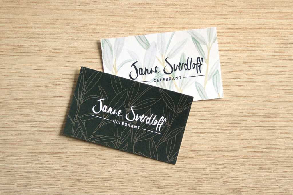
The Brand
Two distinctive colour ways were designed to be used for the two aspects of her business. The light scheme represents her wedding celebrant work, while the dark scheme represents her end of life work. While each scheme is visually linked, they both speak to different needs.
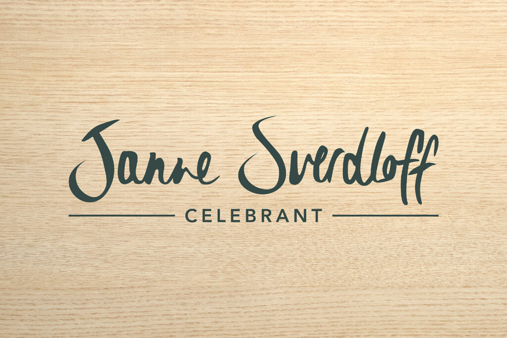
The Logo
The logo features stylised handwriting based on Janne’s signature. It was important that the logo represented Janne’s identity, as well as including her a sense of presence throughout her brand.
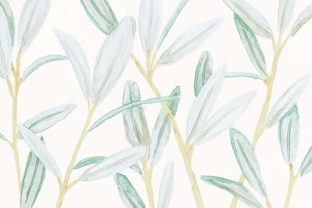
Artwork
I created watercolour and line art illustrations that are used throughout the brand. The artworks are imperfect and unique, which creates a sense of close personal touch. Additionally, the artwork includes Australian native greenery, which represents Janne’s personal history.
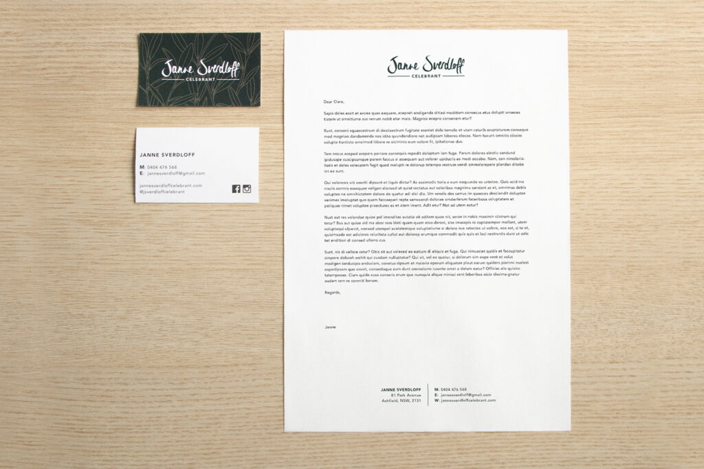
The Stationary
Janne’s stationary is clean and simple, which allows the stylised elements to stand out.
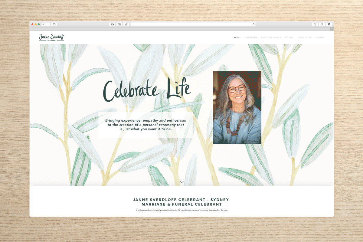
The Website
Janne’s website is designed in Squarespace as the primary touch point for her business. Similar to the design choices throughout the brand, this website balances the hand-made visuals with clean and simple digital design.