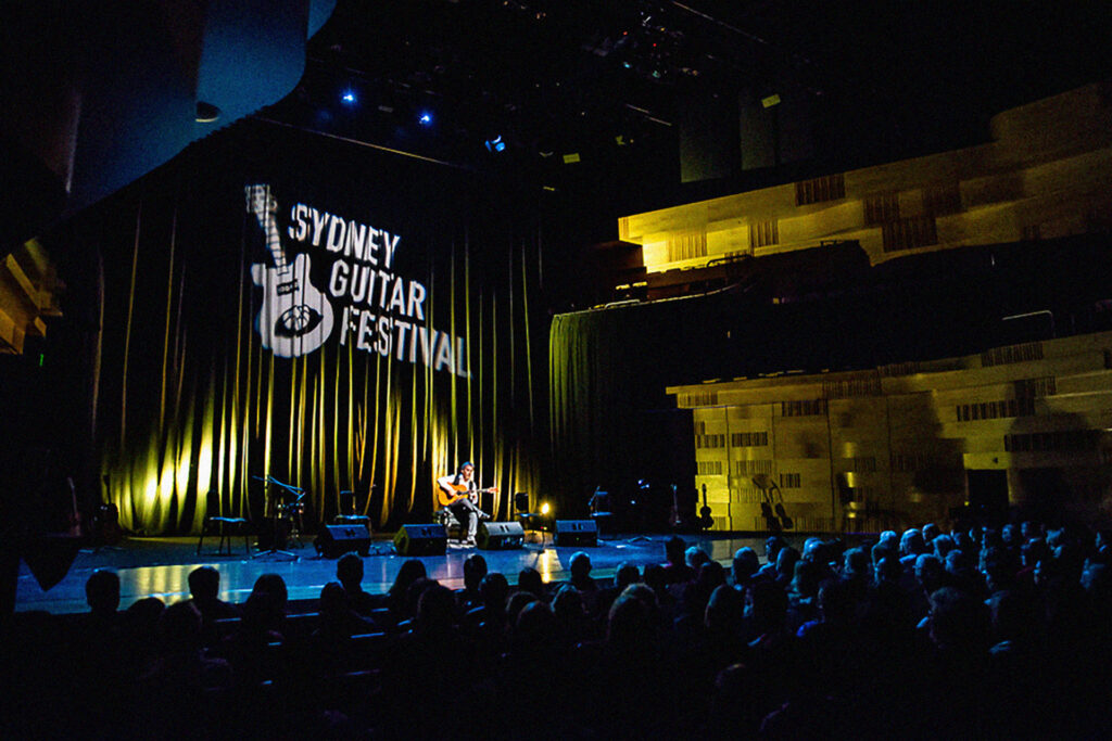
Wanting a refreshed visual identity, in 2018 I completely rebranded the Sydney Guitar Festival. The primary goal of the rebrand was to transform the existing brand into something more easy to use in a variety of marketing contexts. The secondary goal was to frame the festival as something more appealing to an older demographic, by simplifying the design.
The Logo
The first design challenge in this project was to re-design the previous logo into something more usable and versatile. The new design features a simplified version of the primary illustration, and is paired with clean and simple typography.
A secondary version of the logo frames the logo into a shape created by two guitar picks.
Illustration
The main artwork used throughout the brand was briefed to be a re-imagining of the previous year’s art by Reg Mombassa. The new illustration simplified the creative, while still celebrating movement in music.
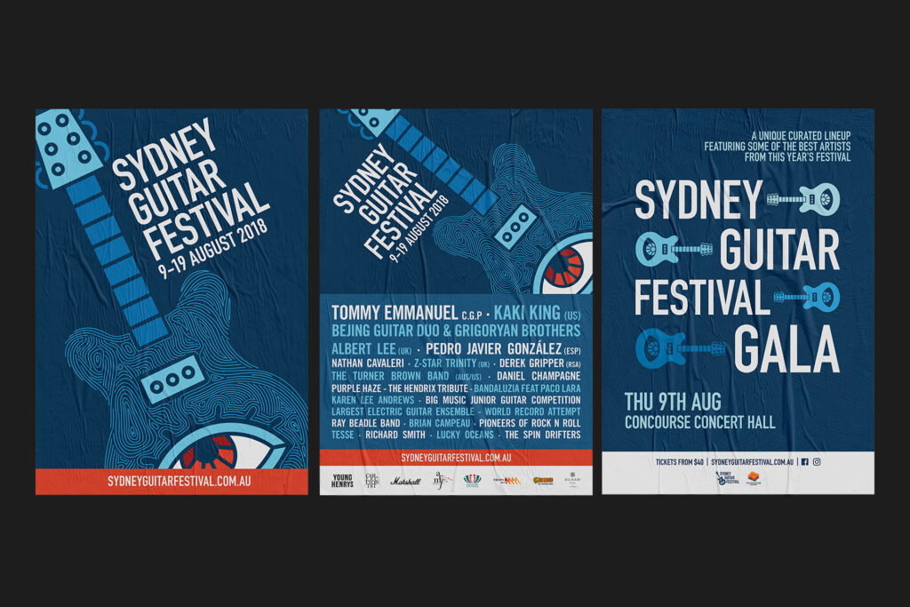
Event Posters
I designed a variety of event posters for the Festival, and it’s internally produced Galas. Two posters were designed for the Festival itself; one focusing on raising awareness of the Festival itself, and the other advertising the artists participating.
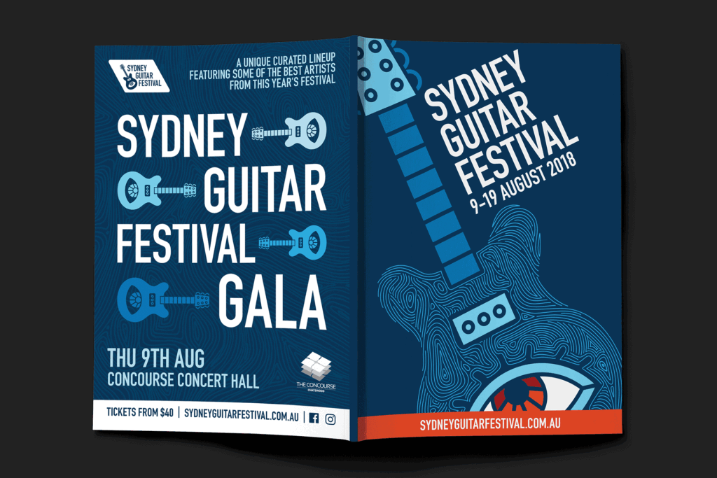
Printed program guide
The Festival Guide included event listings, calendars and ads.
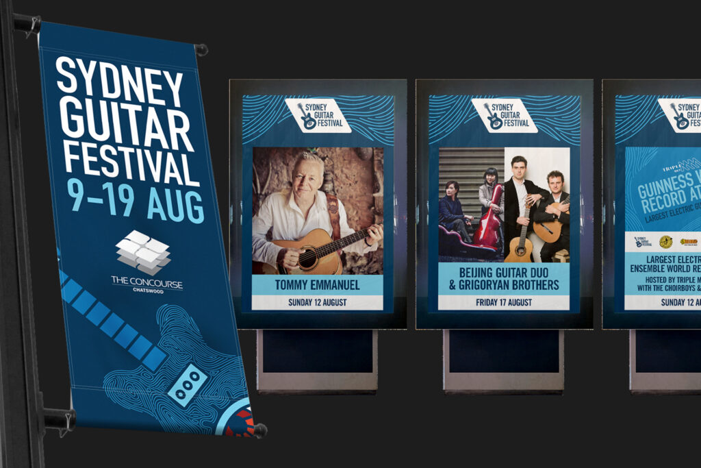
Outdoor signage
A variety of large scale advertisements were made to raise awareness of the event, including both festival generic ads and artist specific ads. These were installed around the local community and outside participating venues.
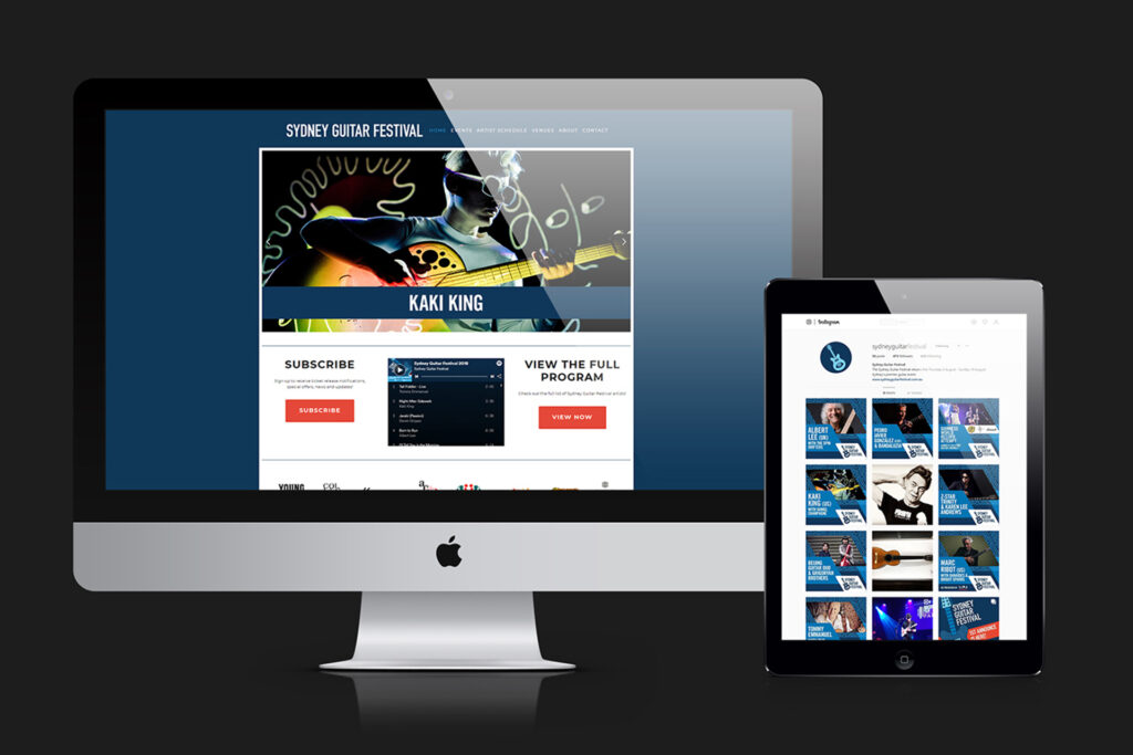
WEBSITE & SOCIAL MEDIA
The existing website was re-skinned to match the new brand.
Additionally, a suite of social media assets were created to announce acts joining the festival, adding branding to the Festival’s social media presence.